IDENTITY DESIGN . PRINT DESIGN
The logo form Inspired by the proud pan Arab history of Saladin but represented in a contemporary visual language. The logo form captures the essence of the warrior Saladin with the use of optimal lines and through it, it represents the essence of the the company EpDeSa.
EpDeSa Identity
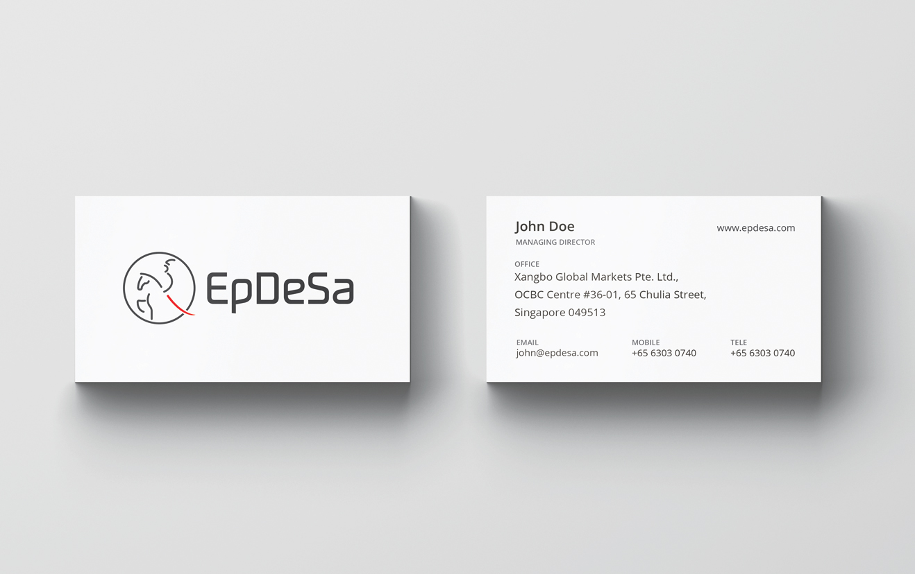
EpDeSa is a global Oil trading company, with a clear middle eastern base. The name EpDeSa is a play on Epee de Saladin, meaning the Sword of Saladin, known as the most advanced sword of the middle age made with a special damascus steel imported from India.The logo form Inspired by the proud pan Arab history of Saladin but represented in a contemporary visual language. The logo form captures the essence of the warrior Saladin with the use of optimal lines and through it, it represents the essence of the the company EpDeSa.
The logotype is created specially for EpDeSa as a complimentary unit with the logomark. It is a san serif font to go with the modern and contemporary look and also to echo the consistent line thickness of the logomark. But its weights are made heavier to contrast with the mark and to make it visually stronger. Its got open terminals to go with the openess and the transparentness as an overall combined visual look and feel.
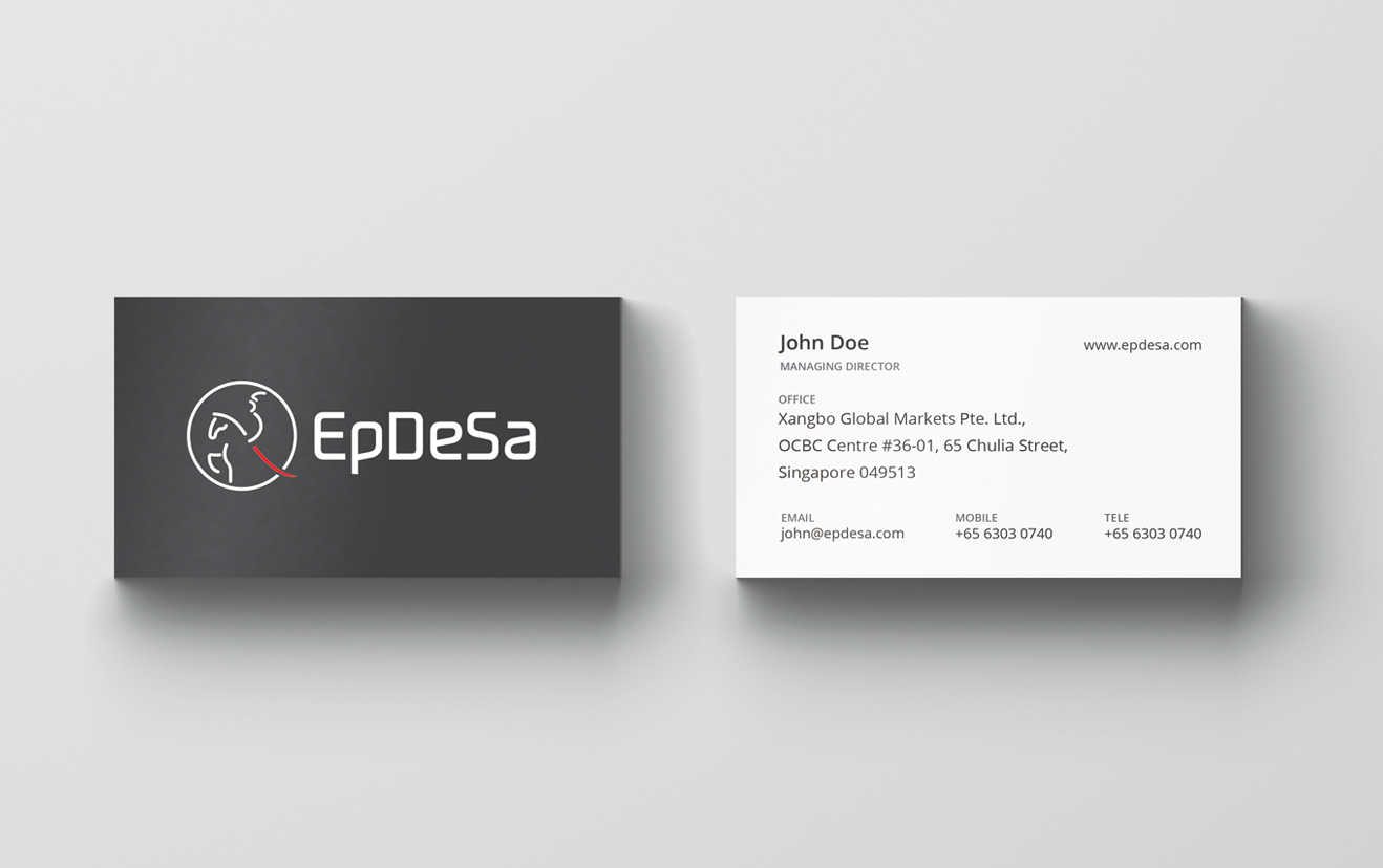
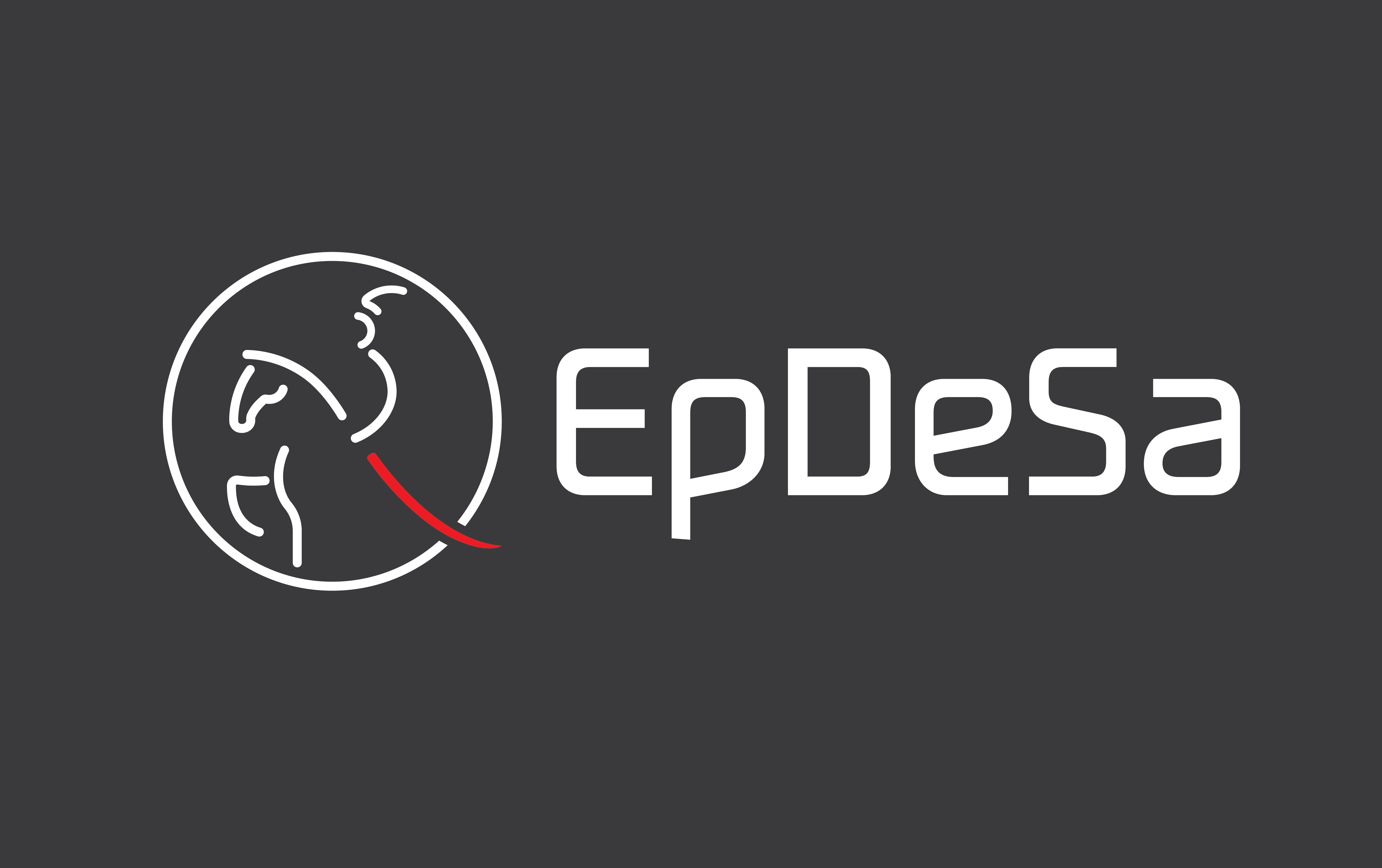 Reverse
 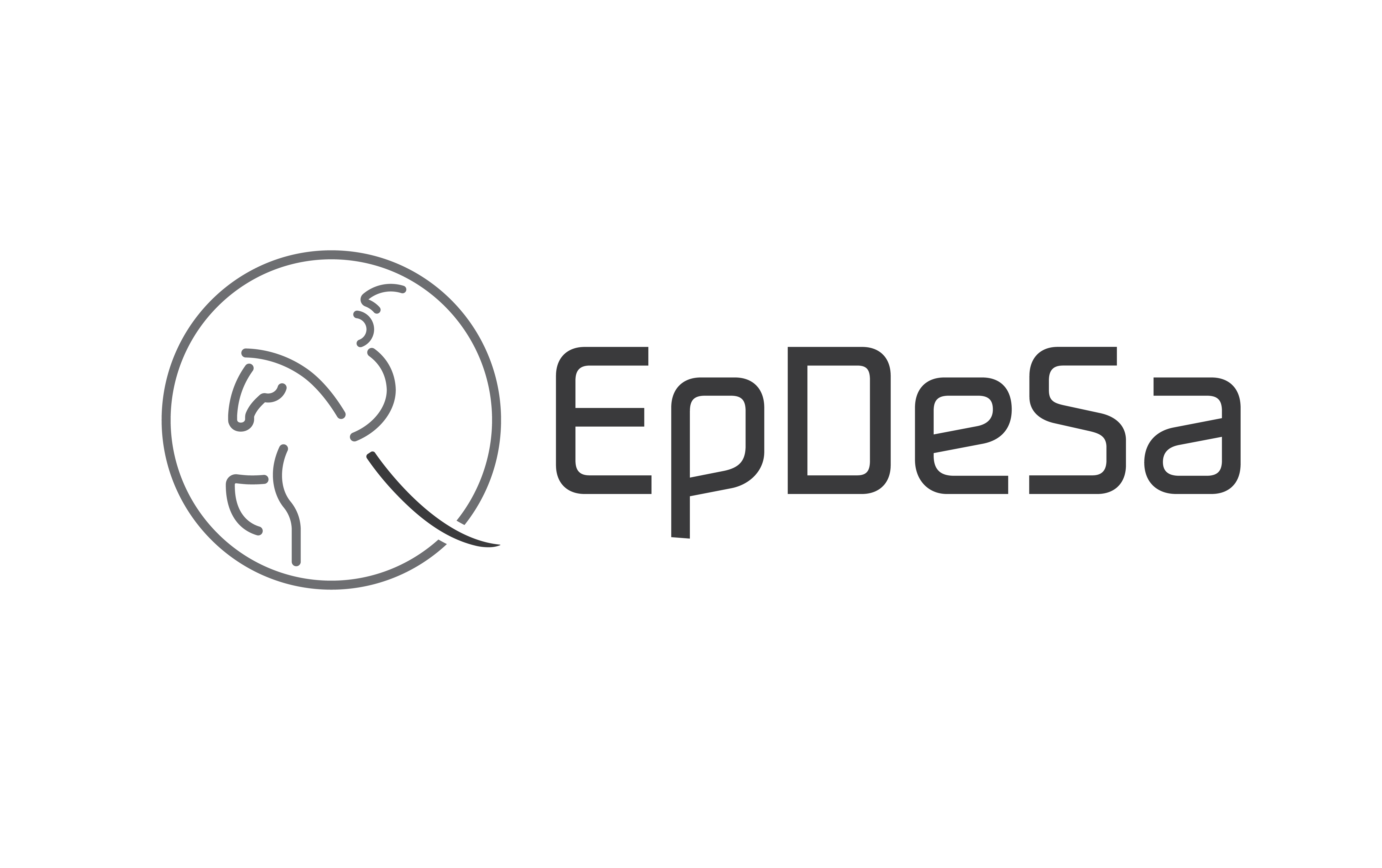 Grayscale
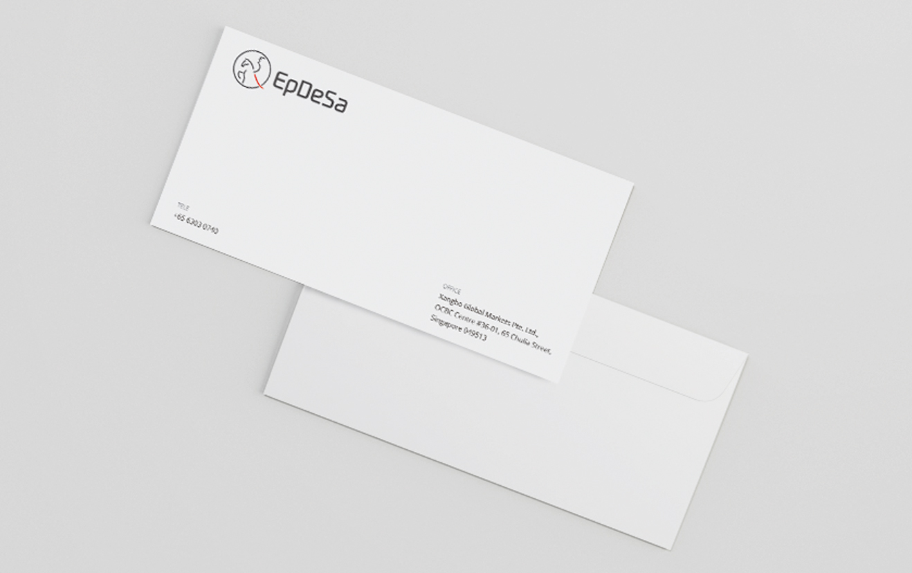
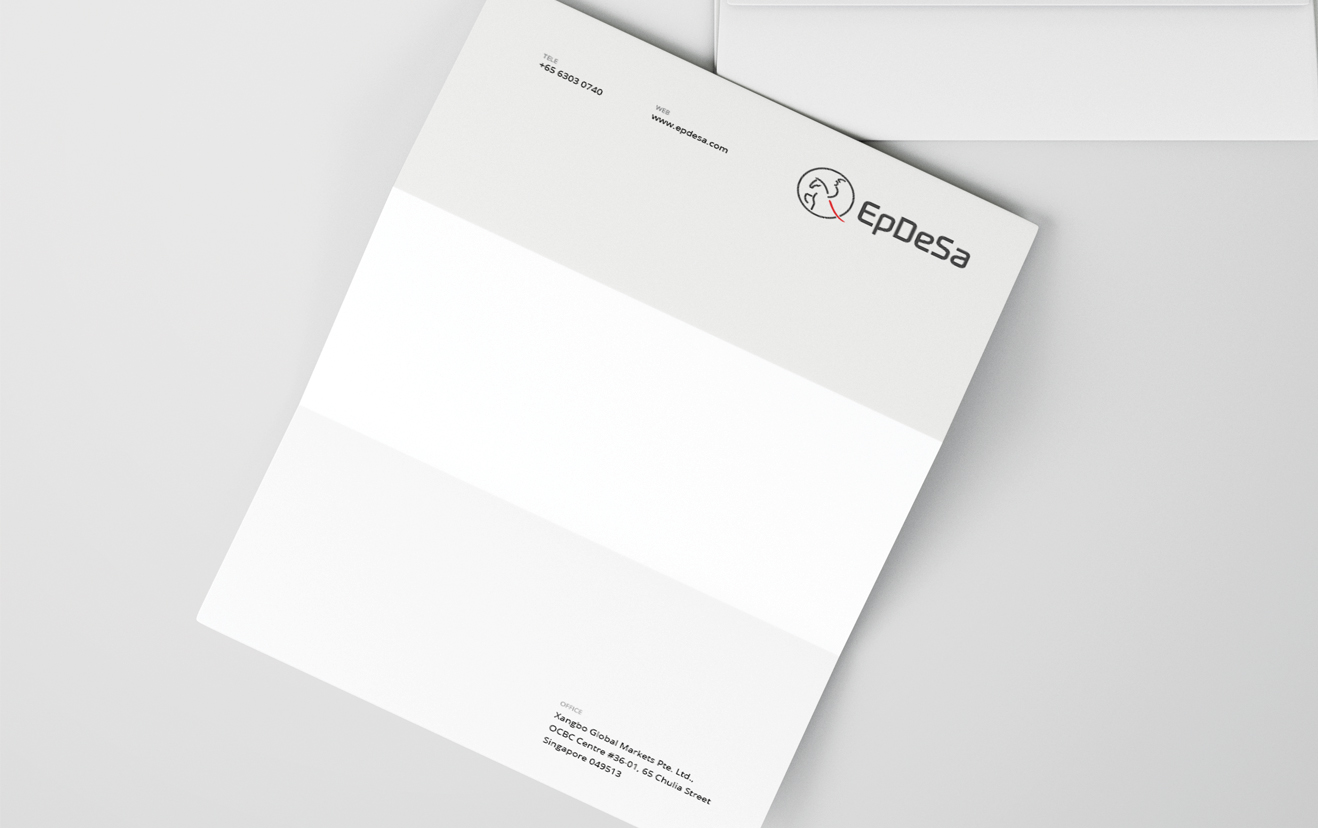
Stationery